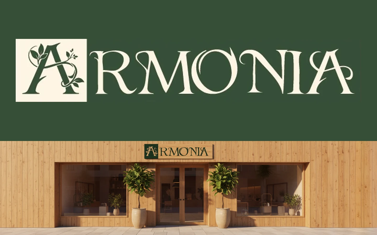
The client came with a single certainty: the name, Armonía. The goal was to launch a line of high-quality herbal teas, designed to support wellbeing and ease different symptoms, that looked premium while staying affordable. It had to be fit for an important business meeting and, at the same time, within reach of anyone who wants to cool off or relax at home with a quality tea. Starting from that name, I developed the complete identity, the labels for the first launch and a series of custom mockups to present the brand before production. Today the client uses it on its products.
Every cup, a moment of balance.
The symbol is a letter A sprouting stems and leaves: the brand's initial turned into a growing plant. The name and the product read in a single stroke, and the symbol works on its own as a seal, icon or wax stamp.
Elegance comes from a classic-inspired typeface and a palette reduced to forest green and cream; the natural feel, from leaves, kraft and earthy tones. The result is a brand that feels carefully made and high-quality without looking out of reach.
// WHAT WAS BUILT
02
Logo system
Logo with the symbol built into the A
Versions on cream, green, black and white
Standalone symbol for seals and icons
03
Printable packaging
Front and back label for Pasión Tropical
Seal to close the box
Tags for the tea bags
04
Custom AI mockups
Boxes, kraft pouches and jars
Stationery, cards and wax seal
Storefront and the tea moment
// THE BRIEF
What the client was looking for
01
Premium yet affordable
A high-quality image that does not push buyers away on price or pretension.
02
Elegant and natural
Convey a natural, carefully made product with quality ingredients.
03
Wellbeing
Herbal teas designed to support wellbeing and ease different symptoms.
04
A growing line
Launch a cold infusion first, Pasión Tropical, and add a hot version later.
// TARGET AUDIENCE
Who the brand was designed for
01
Companies
A tea that looks right at an important meeting and makes a good impression on clients and partners.
02
Everyday consumers
People who want to cool off at home with a natural, tasty, well-priced drink.
03
Those seeking a pause
Those who want to relax with a quality tea and take care of their wellbeing.
// PACKAGING
The first launch: Pasión Tropical
Pasión Tropical is a cold infusion of hibiscus, strawberry, blackberry and lemongrass. I designed its printable pieces for the first package: the parent brand stays understated, while the flavor comes alive with a jungle of tropical flowers, fruits and birds that sparks the craving before the box is even opened.
01
A front that sells
The flavor name up front, a clear promise ("A fruity symphony of hibiscus, strawberries and blackberries") and the net content: 20 tea bags.
02
A back that informs
Step-by-step preparation, ingredients, manufacturer details and barcode, ready for retail.
03
Seal and tea tags
A seal to close the box and tags with the symbol for each tea bag, carrying the brand all the way to the cup.
// CHALLENGES AND SOLUTIONS
Premium without being out of reach
The brand had to look fit for a boardroom and, at the same time, approachable for everyday consumers. The answer was understated elegance: two colors, a classic typeface and natural materials like kraft, which communicate quality without suggesting a high price.
Seeing the brand before producing it
A small business cannot always print prototypes of every piece. I used artificial intelligence to generate custom mockups with the real logo and colors, so the client could see the brand on boxes, jars, stationery and even a storefront, and decide with confidence before investing in production.
// GALLERY
The project in pictures
01 / 14
Tap an image to see it full screen.
// PROCESS
How I did it
01
Brief
A name, a dual audience and a first flavor.
02
Concept
The A that blooms like a plant.
03
Identity
Logo, color, typography and pattern.
04
Packaging
Printable labels, seal and tea tags.
05
Mockups
Brand visualization with AI.
// VISUAL SYSTEM
Color and typography
Tap a color to copy its code.
Armonía
Aa Bb Cc 0123
Citadel of Blackrose
Logotype: classic-inspired serif with organic terminals that evoke stems and leaves.
MISSION ACCOMPLISHED
Results and impact
A brand in use, applied by the client on its products today
A premium, natural identity that stays approachable for consumers
A packaging system ready for new flavors, such as the hot version